
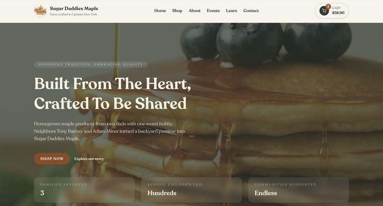
A small-business website does not need dozens of pages or complicated effects to work well. It needs to answer the right questions, earn trust, and make the next step easy. These five mistakes often look harmless but can quietly send good prospects elsewhere.
1. The first screen does not explain the business
A clever headline is not useful if visitors cannot tell what you provide, who it is for, or where you work. The opening section should make those basics understandable in seconds and pair them with one clear action.
2. The site is organized around the company, not the customer
Internal terms and company history matter less at the beginning than the questions a customer is trying to answer. Organize pages around recognizable services, problems, outcomes, and decisions. Put supporting company detail where it builds confidence instead of making visitors decode your structure.
3. Mobile visitors get the leftover experience
A layout can look polished on a large monitor and still be frustrating on a phone. Small text, crowded menus, buttons near the edge, oversized images, and forms with awkward fields create unnecessary friction, especially for local customers searching while they are away from a desk.
- Navigation is obvious and can be used with one thumb
- Buttons are large enough to tap and describe their destination
- Text can be read without zooming
- Forms use the fewest fields needed for the next step
- Important phone, location, and hours information is easy to find
4. Claims are not supported with proof
Words such as quality, trusted, and professional are common because any business can use them. Replace broad claims with evidence: real project photography, specific testimonials, process details, qualifications, service guarantees, meaningful numbers, and examples that show what good work looks like.
5. Performance and accessibility are treated as finishing touches
Heavy images, unnecessary scripts, weak color contrast, missing image descriptions, and confusing heading order make a site harder to use and harder for search engines to understand. Speed and accessibility belong in the design process because they directly affect the customer experience.